
You can create some beautiful content by using some simple HTML elements. The Warp theme framework offers some neat styles for all HTML elements and a great set of CSS classes to style your content. Basic HTML is very easy to learn and this small guide shows you how to use all styles provided by the Warp framework.
Basic HTML Elements
<h1> Heading Styles
H1. Heading 1
H2. Heading 2
H3. Heading 3
H4. Heading 4
H5. Heading 5
h6. Heading6
H2 Title with under line
<p> DropCap Styles
Use the following format: <p class="dropcap">A Praesent rutrum sapien ac felis</p> You can use any letter, symbol or number.A Praesent rutrum sapien ac felis. Phasellus elementum dolor quis turpis. Vestibulum nec mi vitae pede tincidunt nonummy. Vestibulum facilisis.
A Praesent rutrum sapien ac felis. Phasellus elementum dolor quis turpis. Vestibulum nec mi vitae pede tincidunt nonummy. Vestibulum facilisis.
A Praesent rutrum sapien ac felis. Phasellus elementum dolor quis turpis. Vestibulum nec mi vitae pede tincidunt nonummy. Vestibulum facilisis.
A Praesent rutrum sapien ac felis. Phasellus elementum dolor quis turpis. Vestibulum nec mi vitae pede tincidunt nonummy. Vestibulum facilisi.
<blockquote> Styles
Praesent rutrum sapien ac felis. Phasellus elementum dolor quis turpis. Vestibulum nec mi vitae pede tincidunt nonummy. Vestibulum facilisis mollis neque. Sed orci. Cum sociis natoque penatibu. Pellentesque vel enim urna, sit amet blandit ipsum. Maecenas quis sem sit amet nunc pretium mattis. Sed dapibus semper est, sed pretium erat
— John due
Praesent rutrum sapien ac felis. Phasellus elementum dolor quis turpis. Vestibulum nec mi vitae pede tincidunt nonummy. Vestibulum facilisis mollis neque. Sed orci. Cum sociis natoque penatibu. Pellentesque vel enim urna, sit amet blandit ipsum. Maecenas quis sem sit amet nunc pretium mattis. Sed dapibus semper est, sed pretium erat. Phasellus elementum dolor quis turpis.Praesent rutrum sapien ac felis. Phasellus elementum dolor
— John due
Praesent rutrum sapien ac felis. Phasellus elementum dolor quis turpis. Vestibulum nec mi vitae pede tincidunt nonummy. Vestibulum facilisis mollis neque. Sed orci. Cum sociis natoque penatibu. Pellentesque vel enim urna, sit amet blandit ipsum. Maecenas quis sem sit amet nunc pretium mattis. Sed dapibus semper est, sed pretium erat. Phasellus elementum dolor quis turpis.Maecenas quis sem sit amet nunc pretium mattis.
— John due
Here is a short demonstration of text-level semanticts. The <p> element creates a new paragraph. It will have some space before and after itself. To turn your text into hypertext just use the <a> element.
Text-Level Semantics
You can emphasize text using the <em> element or to imply any extra importance the <strong> element. Highlight text with no semantic meaning using the <mark> element. Markup document changes like inserted or deleted text with the <del> element or <ins> element. To define an abbreviation use the <abbr> element and to define a definition term use the <dfn> element.
Short List with Links
- YOOtheme - Premium Joomla Templates and WordPress Themes
- Warp Framework - Fast and Slick Theme Framework
- ZOO - Content Application Builder
- Stock Icons - For Web and Print Projects
Quotations and Code
Inline quotations can be defined by using the <q> element
.
The <blockquote> element defines a long quotation which also creates a new block by inserting white space before and after the blockquote element.
To define a short inline computer code use the <code> element. For a larger code snippet use the <pre> element which defines preformatted text. It creates a new text block which preserves both spaces and line breaks.
pre {
    margin: 15px 0;
    padding: 10px;
    font-family: "Courier New", Courier, monospace;
    font-size: 12px;
    line-height: 18px;
    white-space: pre-wrap;
}
Use the <small> element for side comments and small print.
Useful CSS Classes
Here is a short demonstration of all style related CSS classes provided by the Warp framework.
Highlight Content
Drop caps are the first letter of a paragraph which are displayed bigger than the rest of the text. You can create a drop cap using the CSS class dropcap. To emphasize text with some small boxes use <em> element with the CSS class box.
box-content.box-note.box-info.box-warning.box-hint.box-download.Use the CSS class dotted to create a dotted horizontal rule.
Tables
Create a zebra stripped table using using the CSS class zebra.
| Table Heading | Table Heading | Table Heading |
|---|---|---|
| Table Footer | Table Footer | Table Footer |
| Table Data | Table Data | Data Centered |
| Data Bold | Table Data | Data Centered |
| Table Data | Table Data | Data Centered |
<ul> List Styles (CSS3)
These list styles are based on the latest CSS3 techniques and are designed to work in modern browsers (will not display properly in IE6-IE8). To replicate, use the following format: <ul class="class name"><li>....</li><li>....</li>...</ul> (HTML) The class names are listed below, such as "checkmark red".- Checkmark Green
- Checkmark Green
- Checkmark Yellow
- Checkmark Yellow
- Checkmark Red
- Checkmark Red
- Checkmark Blue
- Checkmark Blue
- Checkmark White
- Checkmark White
- Triangle-Small
- Triangle-Small
- Triangle
- Triangle
- Triangle-Large
- Triangle-Large
- Triangle Green
- Triangle Green
- Triangle Yellow
- Triangle Yellow
- Triangle Red
- Triangle Red
- Triangle Blue
- Triangle Blue
- Triangle White
- Triangle White
- Circle-Small
- Circle-Small
- Circle
- Circle
- Circle-Large
- Circle-Large
- Circle Green
- Circle Green
- Circle Yellow
- Circle Yellow
- Circle Red
- Circle Red
- Circle Blue
- Circle Blue
- Circle White
- Circle White
Definition Lists
Create a nice looking definition list separated with a line by using the CSS class separator.
- Definition List
- A definition list is a list of terms and corresponding definitions. To create a definition list use the <dl> element in conjunction with <dt> to define the definition term and <dd> to define the definition description.
- Definition Term
- This is a definition description.
- Definition Term
- This is a definition description.
- This is another definition description.
Forms
Create a clearly arranged form layout with fieldset boxes using the CSS class box.
Icons by IcoMoon
The generated SVG font can be imported back to IcoMoon for modification.
Heading 1 Example
Link style exampleEasy Customization
You can create some beautiful content by using some simple HTML elements. The Warp theme framework offers some neat styles for all HTML elements and a great set of CSS classes to style your content. Basic HTML is very easy to learn and this small guide shows you how to use all styles provided by the Warp framework.CSS Class Names
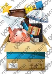
<img> Dynamic shadow
Here some examples are images with dynamic shadow. The shadow is automatically added this with only one class added to the image.

ZOO is a flexible and powerful content application builder to manage your content. It provides a much improved Joomla experience. The key feature is the ability to create your very own custom content types. You define what a type is made up of - e.g. text, images or a file download. Any combination is imaginable! You bring the content, ZOO brings the elements to structure it and make it look good!
Apps for every Purpose
ZOO moves from simply being a CCK to an Application Builder. Apps are extensions for ZOO which are optimized for different purposes and types of content catalogs. ZOO offers a wide range of apps to get you started right away. There is a blog, a product catalog, a cookbook, a business directory, a documentation, a download archive and a movie database app!

Joomla Integration
By now ZOO has developed a thriving ecosystem, with new ZOO extensions appearing regularly. It also integrates well with many popular Joomla extensions. Besides the ZOO component itself offers additional modules and plugins. They allow a seamless integration into Joomla and provide a richer tool set to create your website.
Visit WebsiteYOOtheme is a well-known template and extension provider for Joomla and WordPress who helps you to create professional websites. But to make your website or interface design a real eye-catcher we had one thing missing: Icons! Icons are an essential tool to simplify user interfaces and today almost every major website uses icons to highlight important parts in their content.
This is why we created a great resource of beautiful and handcrafted icons for web and print projects. We got commercial icon sets including e-commerce, community, file and folder icons and many more as well as many freebies.
As a member of our icon club you will get access to hundreds of handcrafted and detailed icons. New icon sets are added continuously!
Club Icons
- Pixel perfect design
- PNGs in 8 sizes from 16x16 to 512x512 pixels
- Handmade and optimized for each size
- Scalable vector sources
- Change the colors and customize easily
This theme comes with different module styles, badges and icons. For each module you can pick a style and combine it with an icon or badge to create your own unique look. Here is a list of the available options:
| Styles | Box |
| Badges | Hot, New, Free, Top |
| Icons | Download, Twitter, Mail, Bubble, Login, Cart |
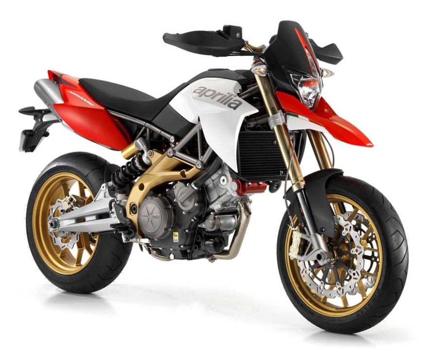
Dal progetto che ha rivoluzionato il mondiale Supermoto nasce Aprilia Dorsoduro 750. Una moto unica, elitaria, nata dall’esperienza racing di Aprilia
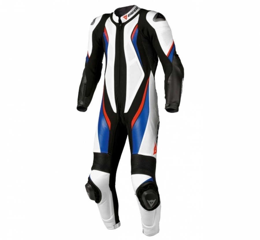
Tuta professionale Dainese Aspide. Per spostamenti veloci e movimenti precisi sulla moto.